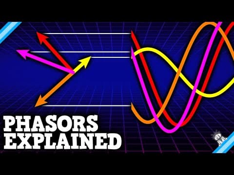
[0:00]Hey crazies, alternating current is kind of wild if you think about it. Electric charge drifting back and forth, all because a power source is flipping back and forth? Even weirder, some circuit components can be ahead or behind that drift. If there's a capacitor and an inductor in there, the cycles would look like this. It's bonkers. But what if I told you there's a better way? What if we pretended those arrows are rotating instead?
[0:32]That might sound crazy, but after all, this is the science asylum. Then again, it's not actually that big of a leap. With the exception of solar panels, all large-scale energy generators use rotation. There's either a spinning coil or a spinning magnet, depending on the design. We might as well work with the theory the same way. When we have the arrows rotating like this, they're called phasors. Phasers on full power, Captain. No, no, no, not not those kind of phasors. But you said, yeah, phasors, not phasers. Phasor is short for phase vector. Man, I was really excited. All right, I I should probably be starting this from the beginning anyway. There are two major categories for electricity. Direct current or DC, which is where charge drifts steadily forward. And alternating current, or AC, which is where charge drifts back and forth. Each of those currents is a response to a voltage. Direct voltage causes direct current. That's the kind you get from things like batteries. Batteries are simple, easy to understand, and portable, but they're terribly inefficient, so they're expensive. Alternating voltage causes alternating current. That's the kind you get from the wall sockets in your house. This type of current is a little more difficult to understand and a lot more dangerous, but it's more energy efficient over long distances. So it's what we use in our power grid. It's the topic of today's video, so let's get into it. In the US, the typical household voltage alternates gradually between plus or minus 170 volts. It does this at a frequency of 60 hertz, that's 60 times per second. Fast, fast! Obviously, this animation has been slowed down, so you can see what's actually happening. Wait, 170 volts? I thought the US was 120 volts. Oh, that's that's the RMS value, not the max value. RMS value? Yeah, it's it's a kind of average. If you have a wave like this, what we typically call a mean average isn't very useful. For every positive value, there's an equal but opposite negative value. The mean average would be zero every time. But if we take a square of the wave first, then you only have positive values. We then take a mean average of that new wave. A square root brings the units back down to volts. What we arrive at is a root of the mean of the squares. The root mean square or RMS value. You lose information when you take averages, so you have to be kind of careful with these. But the RMS value is very popular. So popular in fact, that they're the standard for quoting numbers in AC electronics. If you see a number like 120 volts without any qualifiers, it's an RMS value. Easiest way to get from that to a max value is to multiply by root 2. That's where I'm getting 170 volts. That 170 volts is what matters today. We could imagine this arrow drawing out a wave on a moving piece of paper. Alternating voltage is governed by wave mechanics. That doesn't look so bad. Yeah, but that's because we're only looking at one arrow. The voltage source isn't the only arrow though. Each circuit component gets its own arrow. Each circuit component draws its own wave. I don't know about you, but that looks a little overwhelming to me. The waves aren't even in phase with each other. Each of those circuit components is responding to the voltage differently. For resistors, that response looks like this: Ohm's law. The unit for resistance is ohms. Get it? It's an Omega. It's a pun and I love it. For capacitors, the response looks like this: the unit is farads, named after Michael Faraday of Faraday's Law fame. Inductors respond to voltage like this: the unit is Henrys, or Hank's, as I like to say. Ridiculous.
[4:34]Remember, electric current is just the response. Voltage is the cause. In a wave diagram like this, the capacitor and inductor are messing everything up. They don't respond to the voltage source, they respond to the changes in the voltage source. That puts them either ahead or behind the rest of the circuit, which can be kind of challenging to see in a wave diagram. That's where phasors come in. Yeah, phasors on metaphorical power, Captain. Fire it will. Along the horizontal, we have a number line, a single axis. An alternating voltage is continuously changing length along that axis. But say we imagined a second axis, a vertical axis, an imaginary axis. Well, we'd have something called the complex plane. One real axis and one for pretend. Believe it or not, adding this pretend axis makes things way easier because of Euler's formula. If all you have is a real axis, your wave might be written as a cosine. But adding an imaginary axis gives us an imaginary sign term. Euler's formula tells us this whole thing is just an exponential, which is a lot easier to work with. The exponent is the angle around the circle. You start at zero, the positive real axis. As the angle grows, the arrow rotates counterclockwise. The real and imaginary pieces change, but the total length of the arrow is always the same. Oliver Heavyside pioneered the use of this math in electric circuits. The man never gets the credit he deserves. Good old Olly saw Euler's formula and was like, oh, yes. Oh, yis.
[6:18]If the real axis is in volts, then the length of this arrow is the max voltage. Remember, that's 170 volts for household outlets in the US. No matter what, this arrow is 170 volts long. What changes is the projection of that arrow onto the real axis. That projection changes over time because of the arrow's angle. Angles in this diagram are called phases, which is just leftover language from that earlier wave diagram. Since this arrow acts like a vector and the angles are called phases, we call this arrow a phase vector or phasor for short. It's a very descriptive name, and it sounds wicked cool. I approve 100%. So what happens when you have multiple arrows? Math magic. If all you have are resistors in your circuit, then it's not all that interesting. The arrows line up, they're in phase. Inductors are 90 degrees ahead of resistors, though. We say they lead by 90 degrees. That means they'll shift the arrows out of phase. The source voltage has to be split between the two different components. But if you look at the electric current, you'll see it's only listening to the resistor. That means the voltage source and the current are out of phase. It pulled them out of phase by a very specific angle. This angle. It's called the circuit phase angle, and it can be found with some simple trig. That angle doesn't change over time either. All the arrows rotate together. If you want to figure out the real voltages at any given time, just pause, measure the angles, and find the projections.
[8:16]Cool. I know, right? I love phasors so much. Alternating current looks like this: electric charge drifting back and forth. On an oscilloscope screen, you might see something like this: multiple waves with some ahead and some behind. But the phasor diagram is much easier to use. Just a few arrows rotating around as a set. Here are all three together, so you can see them in sync. When the resistor arrow is horizontal, the current is moving as quickly as possible, and its wave on the screen is at maximum. When the resistor arrow is vertical, the current is momentarily stopped, and its wave on the screen is at zero. A similar thing happens for the inductor and for the capacitor. Over and over and over again. At least until the power goes out. So what do you think? How cool are phasor diagrams? Pretty awesome, right? Let us know in the comments. Thanks for liking and sharing this video. A special thanks goes out to my Patreon patrons and YouTube members, like Dhruv Singhal, who's pledging support at our asylum orderly level. Don't forget to subscribe if you'd like to keep up with us, and until next time, remember. It's okay to be a little crazy. Several of you asked why dark energy wasn't in my pie chart. Simple, my pie chart was specifically about the proportions of matter. Dark energy is not matter. I'll do an episode about dark energy at some point, but I need to do a follow-up dark matter video first. Anyway, thanks for watching.


