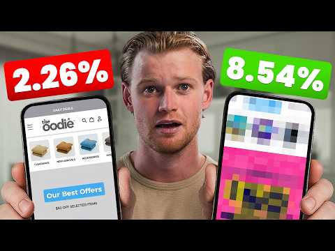
[0:00]Most Shopify stores are converting at under 3%. If that's you, you're leaving thousands of dollars on the table every single month. Everyone tries to grow their business by introducing more ads, sending more emails and pushing more traffic to the top of the funnel. But almost nobody talks about the fact that if you simply 4x your conversion rate, you would take your business from $500,000 to $2,000,000 overnight. Sadly, 99% of brands aren't doing CRO at all. And the ones that are, they're split testing button colors like it's 2019. In this video, I'm going to give you the exact framework that I would use if I was starting CRO from scratch. And make sure you stick around because by the end, you'll have a step-by-step game plan to turn more visitors into buyers this week. So, what CRO actually is, and why it matters? It stands for Conversion Rate Optimization. And it's really simple: It's taking the traffic you already have and turning more of those visitors into paying customers. Most brands, as I said, they don't think like this. They're obsessed with traffic, pumping money into ads, chasing new channels. Alternatively, they just start trying to grow their TikTok all of a sudden, even though they've got an existing website. And sure, traffic does matter, but if your site doesn't convert, all you're really doing is pouring more water into a bucket that's filled with holes. Here's why this is such a big mistake: Imagine you have 10,000 visitors hitting your store each month. If the conversion rate is 2%, that gives you 200 orders. But if you can lift that to 4%, that's 400 orders. The same traffic, double the sales, at no extra cost to the business. That's the real power of Conversion Rate Optimization. The average Shopify store converts at 1 to 3%. The top 1% can hit 6 to 8% or higher. Now this does obviously depend on what niche you're in, what your average order value is, but that is the average. But here's what a lot of people don't understand is that conversion rate alone doesn't tell the full story. Conversion rate tells you how many visitors buy, but AOV tells you how much they spend when they do. And when you combine the two metrics, you get RPV. Then once you subtract all of your costs, you're left with PPV, profit per visitor, which is the metric that really matters. If an optimization doesn't increase RPV or PPV, then it's just noise. A 5% conversion rate might look impressive on paper, but if it drives down your average order value and increases your costs, you're worse off. So focus on RPV and PPV, because they're the things that are going to keep the lights on. The other thing to consider is don't focus on these just for this month. Think about it from a lifetime value perspective. So, why isn't your store converting and what the great brands are doing instead? Most Shopify stores fail at zero because they're built like old school retail sites. They're making mistakes that instantly kill trust and stop people from buying. So, what are some of these common mistakes? The first is inconsistent branding. You click on an ad and land on a site that looks completely different. Colors clash, fonts don't match, and the whole experience feels slightly off. This is a lot of the drop shippers out there. Then we've got weak product info, such as no sizing charts, no shipping timelines, and no clear explanations of the benefits of the products. Then we've got too much or too little text. It can definitely go both ways. Some stores drown you in copy, others give you one line and a blurry photo. Either way, customers aren't going to trust that. Then we've got fake urgency, which it can, you know, urgency can be a great conversion rate boost, but if it feels disingenuous, it's not going to help you. Another one which is really bad for early stage brands that have just gone started and don't have typography is low quality visuals. Such as blurry photos or generic stock images that make your product feel cheap. You want people to see the product and instantly go, I know exactly what I'm buying. I know the fabric color, I know how it can fits, how like this top right now, you can see because I'm in video, you can see exactly how it fits. If they had a blurry photo or they used a blurry video, you wouldn't build feel that trust instantly. Next is cluttered navigation, such as this one where there's just so many different options, as well. You really want to simplify that as much as possible. What are the great brands do instead? I'm not sure we should have used Oodie here, there's plenty of great brands, but we do do this quite well nowadays. We've got consistent branding. You can see this is from an email with a 30% off. Then we've got the exact same branding, the fonts and the vibe, the photography feels the same on the actual header image on the website. We've got clear product info, we've used these iconography down here to just describe the product details. Which people don't even need to read that, they can just see the icons and know exactly what it means. Then we've got real offers, genuine discounts, seasonal campaigns, and bundles that they actually add value instead of gimmicks. High quality visuals. We spent so much money on photography to make sure customers know exactly how soft the product really is. Then we've got simple navigation, which truthfully, this is an art. I didn't even think our navigation is as simple as it could be, but it does get hard when you have lots of products. The truth is, most of you probably don't have lots of products and you can simplify yours a lot further. So, what's one of the main things you could do to get way better conversion rate? I would fix the offer first. The biggest leverage point in CRO is your offer. Getting this right is what takes a brand from 500K to 2 million. When I say offer, I don't just mean the product. I mean the full package, such as the price, the bundles, the upsells, even something like a guarantee. Even the way you position the value. All of these things together is what makes someone decide if it's worth buying. But most brands don't think about their offer this way. They simply think about gut feel and they just copy and paste exactly what the competitors are doing, which is the worst thing you could do. You need a unique offer. CRO is all about testing, measuring, and adjusting. So what happens if your price is $1 higher, or $5 lower, you won't know until you run the test. Even the smallest changes can shift your revenue and profit in a big way. Think about it. If you sell a product for $50 with a 2% conversion rate, that's 100 orders per 5,000 visitors. Now if you raise the price to $55, the conversion rate might stay exactly the same. In fact, we've actually increased the price and it's gone up, which is crazy. That's an instant 10% lift in revenue without more traffic, or maybe the conversion rate dips slightly to 1.8%, but you're still generating more total revenue because every sale is worth more. You're probably delivering way more profit as well because to facilitate those orders, it's far cheaper. You've got less customer service, you've got less operations, the product cost itself is a better percentage of the revenue. So for example, 5,000 visitors at 2% conversion rate and $50 AOV is $5,000 revenue. The same 5,000 visitors at a 1.8% conversion rate and $55 AOV is $4,950. Almost the same. Next thing, we've also got a pre-purchase pop-up upsell, which can also work. It's similar concept, but before the checkout, it will pop up and it will be a far more obvious experience. Then we've got post-purchase upsells and downsells. In daily mentor, we've got a great partner that we work with. The customer will actually complete the order, and then on the next screen, where it's the thank you page, there's another really good offer, an offer sequence that can drastically increase the profit per customer that you've actually made. Because each customer you've already paid the customer acquisition cost. Now it's about getting as much value from that customer and providing great offers for them to make it more profitable for your business. The next thing that we've got is bundles and variants, which a lot of people don't understand. The first is multi-packs with small discounts, which you can see here, I think this is True Classic. Where they're just adding multiple of the same products, if you've got anything where someone will need that, I highly recommend testing that. Then we've got premium or deluxe versions. I've seen people doing this with like diffusers where one would have sound and beautiful smell, one just had the beautiful smell, and you it was all on the same product page. But just simply adding those other offers drastically increase that conversion rate. Then we've got decoy pricing. I don't really know about this one. I don't really recommend it, but it does work, and a lot of people use it where there's like good, better, best pricing, and you want people to take the the most premium option because it's so packed with so many features. So next up, we've got test, iterate, and repeat. Once your offer is dialed, your work isn't over. CRO is never finished. Markets shift, customer preferences change, competitors copy you. And more importantly, behavior changes.
[8:36]When people see a certain unique offer or a certain, you know, user experience on a website, such as like a way that you sign up for emails, and they see it over and over. Sometimes it loses its impact because people are just so bored of it. So, you constantly need to test it. Because what worked last year won't necessarily work next year. That's why the best brands treat CRO as a process, not a one-time project. Test one variable at a time, such as price, your headline, call to action, upsells, your bundles, all of that kind of stuff. And never all at once, otherwise, you'll never know what caused the change. One small focused test gives clarity. And make sure you use the right tool. I highly recommend Visually. I've talked about me being an investor with them, and I think that they're amazing with their drag and drop editor. Now one thing's for sure, you don't want to overcomplicate tracking. A spreadsheet works when you're small. As you grow, move into dashboards to see patterns faster. Now here's one concept that blew my mind when I learned it. One test might add 10%. Another one adds 15%. And then another one adds 20%. On their own, each feels small, but together, the gains compound. Suddenly you're not just 45% better, which is just adding each of those numbers. You're two to three times better because they're all multiplying together. And that's the snowball effect of CRO. Small wins stuck until they transform your store. And this creates what I call the CRO flywheel. Every win, every better product page, smarter offers, smoother checkouts, these boost revenue and boost profit per visitor. Efficient ads free up budget, scale, more tests, more wins, more growth. And this cycle just continue. Next is we've got build trust and handle objections. Once your offer is strong and you're testing one thing at a time, the next step is trust. Because even if you have the perfect price and bundles, if people don't believe you and still have doubts, they won't buy. Obvious one is reviews as proof. People buy from people. Numbers and logos don't convince anyone anymore. Real customers do. The right review can definitely do more than your creative copywriting, and the best reviews don't just say something like great product. They speak directly to the objections running through a buyer's mind. Use this framework to spot really great reviews that you can highlight. At first, I thought X, but actually Y because the customer is already thinking the exact same thing. So for example, at first I thought the bands would rip, but they've lasted months of daily use. Another example, I thought the blanket would be too hot, but it's the perfect weight for all seasons. When written this way, reviews act like pre-answered FAQs from real people. They let new customers see that others had the same fear, and those fears turned out to be wrong. The next thing is mining objections. So don't wait for these objections to appear in your own reviews. Go digging for them, such as Amazon one-star reviews, even if it's your competitors, TikTok comment sections, Reddit threads. All of these things are goldmines, and that's where you'll see the truth about your product, and the truth about the objections that people have for your product. So, what do we do with all of those objections? We can bank them directly into your product descriptions, drop them in your ad copy, or even use them as pinned comments under your creatives. Instead of hiding the objections, tackle them head-on. Then we've got policies as trust signals. One of the fastest ways to destroy trust is hiding your return, refund, or shipping details. If people can't see them, they assume the worst. So don't bury them in a footer. Put them right on the product page directly under your add-to-cart. Simple lines with free returns within 30 days, or ships within three to five business days, instantly reduce the risk for the customer. And the result is you'll get a higher revenue per visitor. Next, we've got user generated content. UGC can boost conversion rate by up to 30% alone. Why? Because people buy from other people. Unpolished photos, TikTok reactions, raw customer videos. You can put these because they're seeing them as ads, you can even put them on the product page underneath the add to cart or as their own section. They feel real, they feel authentic, and answer people's questions such as, do people actually use this product? Then we've got layering trust across the entire journey. The customer journey isn't just your product page. It starts the very second that they actually land on your site. It actually starts even before that, it starts when they see your creative on Facebook. In less than a blink, about 0.05 seconds, they decide whether they can trust you or not. This is what I was talking about before. If your branding is inconsistent, your homepage feels unclear, or your site feels a little bit scammy, they will bounce. So, make sure your branding is consistent. Do things like, make sure your Instagram even matches the branding. Make sure your story highlights on Instagram all match the same thing because people will just go dive deep, trying to find a reason not to trust you. And remember, not everything in CRO needs to be tested. These things are just common sense, you just want to add them because they will build that trust. Next we've got smooth shopping experience. I'm sure everyone has an experience where they go onto a website, it's really, really overly designed, or you don't know what buttons do what, you're clicking on things and they're not even buttons. If it's clunky and confusing, what's going to happen is the customers are is they're actually going to burn calories trying to think, and people don't want to burn calories thinking about stuff. Our bodies naturally try to prevent ourselves from doing that. So you want to really streamline, you want to copy really, really basic websites, really top sellers, in terms of how their website works. And make sure every button actually clicks through. Then we've got homepage must show value immediately. So your homepage has one job: clarity, value, and direction. Too many brands bury their products under lifestyle content or brand fluff. The homepage turns into a lookbook rather than a store. Instead, feature your key products, front and center. Add a banner that communicates your main offer, such as free shipping, a seasonal sale, a bundle deal, or even if you're a brand new brand. It should just explain exactly what you sell and the solution that you solve. So, how do we make that happen? The hero section of your homepage is your first and sometimes only chance to answer those questions. Start with a clear headline, tell exactly what you offer, add a sub-headline that explains why it matters to them, and then show your product front and center in the hero image, and give them one obvious action like shop now. That's the direction that we're talking about. Then we've got the PDP, which is product detail page. Your product page has to do three jobs at once: inform, persuade, and drive action. Miss one, and the sale is going to die. It should give the buyers the key details they need to persuade them with proof and clear benefits. And then they should simply take action. You want swatches that make colors and sizes easy to choose. We've got the type of pajamas, such as warming and cooling. So that might even just be a style, it might be striped or polka dots. Then we've got sizes as well. It's very black and white about what we're actually selling and they're selecting. You want benefits written in short, clear lines, so people can skim quickly. And the essentials, such as sizing, shipping, and refund information, and the copy itself should never feel heavy. Instead of long, messy paragraphs, break things into sections that open as you scroll. That way the page feels light. This is called an accordion. You can set this up in any theme builder, and then click it and expands the copy if it's relevant to them. We've got the cart and checkout flow. This is where most sales die. This is the final stretch. You spent so much money, time and effort to get them here, how do we make sure that we optimize it? We want them to be able to review, we want to reassure them, and then we want to convert them. The biggest mistake here is forcing customers onto a separate cart page. That extra step adds friction and confusion. The fix at the moment is use a slide-out drawer cart, so shoppers can go straight to checkout. The easiest way to do this is hopefully your theme builder already has it, or you can use other Shopify apps as well. And once they're actually in the checkout stage, make sure you've got all the payment options, such as PayPal, Apple Pay, Klarna, AfterPay, because a slow, clunky checkout without lots of options doesn't build trust. And make sure if you're selling internationally, you've got auto-detect currency and language. Don't make buyers do the math themselves. You can easily get simple apps to auto-convert this, and you can set up with Shopify markets with just a few clicks to give the user the best user experience. I hate purchasing things in USD if I'm actually based in Australia because I don't actually know if their website is even operational in Australia. I want an Australian seller in Australian dollars, and that's what you should be passing onto your customers, that trust and connection. If you like this video, I've filmed completely free guides about how to take your brand from zero to eight figures. It's on YouTube, go check it out now.


