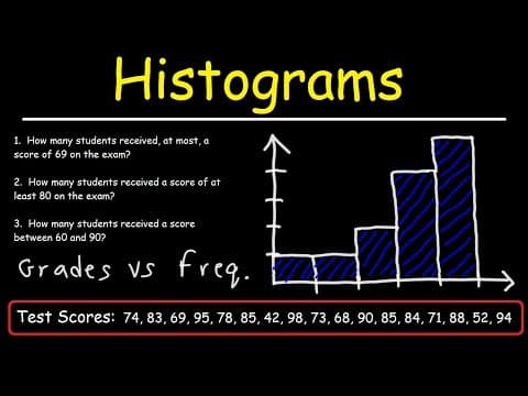
[0:01]In this video, we're going to talk about how to make a histogram. And so what we have here is the test scores of many students in the class. How can we use this information to construct a histogram? Well, the first thing we need to do is create a frequency distribution table. So we're going to have two columns. The first one is going to be the grades and we're going to arrange this. We're going to set up a class with or a range of grades. We're going to group certain values together. And because we're dealing with test scores, it makes sense to group it in terms of in ranges of 10. On the right, I'm going to put the frequency. So the lowest test score that I see is in the 40s. The lowest is 42. So my lowest range is going to be 40 to 49. And then the next range will be 50 to 59. Now, sometimes you can calculate the width. The class width, which in this case is about 10, but for grades, it's just easy to do it this way. We don't really need to calculate it. So how many students received the score between 40 and 49? So looking at our data, there's only one score in the 40s. And that's 42. So the frequency for this range is one. Only one student had a grade between 40 and 49. Now, what about between 50 and 59? The only score in that range is 52. So once again, the frequency is going to be one. Now, how many students received a score between 60 and 69? So, let's see. We have one, two, and that's all I have right now. So two students received a score between 60 and 69. Now, what about in the 70s? We have one, two, three, four. So four students received a grade between 70 and 79. Now, let's move on to the 80s. So we have one, two, three, four, five. So five students scored between 80 and 89. And then finally we have one, two, three, four students received an A or scored 90 or more. And so this is our frequency distribution table. Once we have that set up, now we can construct the histogram. The histogram looks like a bar graph, but the only difference is that the bars are attached to each other. There's no spaces between the bars. On the Y axis, we're going to have the data that corresponds to the frequency. So these are the independent variables. On the X-axis, we're going to put the grades which are the, actually I take that back. This is the independent variables. The grades are the independent variables, the dependent variables are the frequencies. The dependent variables are always on the Y-axis, the independent variables are always on the X-axis. Can't believe I almost mixed that up. So now let's continue. So what we're going to do is we're going to plot these numbers on the X-axis. The lowest number is a 40, and then it's going to be 50, and then 60, 70, 80, 90, and the highest is 100. Now, for the Y values, the highest is five. So I'm going to go up by one. So this is one, two, three, four, and five. So, let's plot the first one. Let's create a bar that goes up to one. So between 40 and 50, the frequency is only one. Now, between 50 and 59, the frequency is still one. And between 60 and 69, it goes up to two. So this one's going to be a little bit taller. And then from 70 to 80, it goes up to four. And then from 80 to 89, or just under 90, it goes up to five. And from 90 to 100, it's four. And so that's how we can construct the histogram for the data that we have here. As you can see, it's a very straightforward.
[5:46]Now, here's a question for you. Using the histogram that we have on a board, would you say the data is symmetric or would you say it's skewed to the right or skewed to the left? What would you say? So our data has this type of shape. So notice that we have a long tail on the left side. So therefore, this type of data, we can say it's skewed to the left or it has a negative skew.
[6:26]It's not skewed to the right, and it's not symmetric. Now, what is the mode for this particular data? The mode is basically the range in this case, with the highest frequency. So most students received a score between 80 and 89. And so that range would be the frequency, I mean, the mode for this particular histogram. Now, sometimes you might be given a histogram and you need to answer some questions using the histogram and nothing else. And so we're going to do that right now. So here on the board, we have three questions. Pause the video, use the histogram to answer these three questions. So let's begin. Number one. How many students received at most a score of 69 on the exam? So what does that mean at most a score of 69? Is that more than 69, less than 69, does it include 69? What would you say?
[7:42]So let's write an inequality. At most means the maximum score is 69. So using S for the score, S has to be less than or equal to 69. It can be up to 69 or less, but not more than 69. So the scores that are below 69 starts here. Everything to the left of 70. So between 40 and 50, we have one student who scored in that region. Between 50 and 60 is one student. And between 60 and 70, but technically between 60 and 69, we have, uh, not one but two students who scored in that range. So the total number of students is going to be 1 + 1 + 2. So thus, we have four students who received a score of 69 or less on the exam. Now, what about number two? How many students received a score of at least 80 on the exam? What would you say?
[9:03]So what does that mean of at least 80? Is that less than 80 or more than 80? In this case, 80 is the minimum. In the last example, 69 was the maximum. So it has to be 80 or more. S has to be equal to or greater than 80. So what we want is the data to the right of this region highlighted in blue. So between 80 and 89, we have five students who scored in that range. And between 90 and 100, there were four students who scored in that range. So 5 + 4 is 9. And so that's the answer for number two. Now, what about the last one? How many students received a score between 60 and 90? Well, let's adjust this and let's say between 60 and 89 inclusive. Inclusive means that we're going to include 60 and 89. Because sometimes it may not be inclusive. It may not include 60 to 89. So this would be 61 to 88. But let's say inclusive. How many students would fall in this range? So our starting point is here, 60. And our ending point is here, 89. So between 60 and 69 there were two students who received a score in that range. Between 70 and 79 there were four students. And between 80 and 89, there were five. So we're going to add up 2 + 4, which is 6, + 5, that's 11. So 11 students received a score between 60 and 89 inclusive. And so that's basically it for this video. Now you know how to create a frequency distribution table, and you could use that to create a histogram. And now you know how to answer questions using a histogram. Thanks for watching.


