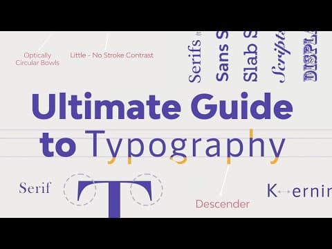
[0:09]Hi, my name is Laura, and welcome to this course, The Ultimate Guide to Typography. Typography is one of the most important elements of design. In this course, you will learn everything about it from its beginning, its evolution, to what it is today. We have gathered the most important terminology and concepts to get you started with typography. You will learn everything from the most basic topics like type classifications and families, the nitty-gritty of readability and legibility, to something more complex, like choosing and combining fonts. After this course, you will be able to confidently talk about typography and experiment with the different concepts and fonts to master your skill. So let's get started.
[1:19]Hi there, and welcome to the Ultimate Guide to Typography. In this lesson, we outline a brief history of typography, all the way from early engravings, to the influence of digital softwares. And the reason of why typography is so important. Typography has evolved greatly throughout centuries. Punches and dies have been used as stamps back in the 2nd century BC Mesopotamia. This is perhaps the earliest form of printing. Similar techniques were used in Babylon, Crete, and ancient Greece. Many of the serif's we use now can be traced back to ancient Roman capital lettering that was used to inscribe monuments and buildings. In the 12th century in Europe, handwriting was practiced by monks who created illuminated manuscripts using blackletter, a Gothic style calligraphy script. The technique was time consuming until the invention of the printing press. Johannes Gutenberg created a machine that could process movable type, allowing a larger number of sheets to be printed using ink. Gutenberg then developed the first ever typeface, blackletter. Starting now, typography would be accessible to the masses. In the 15th and 16th centuries, Roman type styles became popular. Blackletter was difficult to read, and Roman type styles like Jensen, were more readable. Typesetters started to explore different ways to produce affordable books. Space saving techniques like tracking and lighting, led to the development of italic weights. Slanted type styles were used when there was limited space available on the page. By the 18th century, typographers created more refined versions of serif fonts. Humanist serifs like Caslon was used to print documents resulting in extremely elegant design pieces. A couple of decades later, John Baskerville creates the first transitional typeface. Printing presses allowed for refined details. Baskerville featured thin serifs and higher contrast between thick and thin strokes. By the end of the 18th century, the Didot family designed one of the first modern serifs. Which feature extremely thin serifs and very high contrast between thick and thin strokes. Nowadays, this type of font is commonly used in fashion advertising and magazines. The Industrial Revolution brought progress to the mechanical and industrial fields. Printing presses and letterpress evolved. Typefaces were widely available, designers started to experiment with condensed and stretched type for advertising materials like posters and newspapers. The slab serif was born during this era to achieve a punchier and bolder style of serif that would call for attention. The late 1920s brought one of the best known early sans serifs, Futura. The German designer, Paul Renner, was inspired by simple geometric shapes. Around the same time in England, Eric Gill created Gill Sans, the first humanist sans typeface. It featured more organic forms and natural curves. In the late 1950s in Switzerland, another revolutionary step came to fruision. Helvetica was introduced as a functional, ultra legible type, characteristic of the Swiss style. The typeface very quickly came to be used in every form of printing. The invention of computers in the 20th century allowed for digital versions of typefaces. Although there were some limitations due to the lack of screen technology, many fonts were created as pixel type. Computer technology has been gradually evolving and making sophisticated type design softwares. Making fonts available to all computer users. The evolution of typography won't stop there. It has a huge potential to keep evolving and surprise us with new groundbreaking designs. So, why is typography so important? Typography is a way to use text as a visual element to convey a message. When used effectively, typography grabs attention, builds hierarchy, and brand recognition. As a communication tool, it is essential to our society. It is important to understand the principles of typography, otherwise we compromise communication, expression, and clarity. On the next lesson, we will go in depth into the different type classifications and type families. We'll see you there.
[5:49]Hi and welcome back to the Ultimate Guide to Typography. In this lesson, we will look at the difference between typeface versus font. Before we start with more typography, it is important to clarify the difference between typeface and font. These two words are used interchangeably, and while they're both type related, there is much confusion as to their actual definition. The difference between a font and a typeface has its roots in the history of printing. The word comes from the French Fonte, which means cast in metal. Printers cast complete sets of metal letters to make up a font. Fonts with a common design made up a typeface. So fonts were divided by size and upper and lowercase. Each was a different font. When digital typesetting came into play, many of the old printer terminology was maintained. Computers only need a single file to render an entire typeface. Each letter being completely scalable. On computers, the file contains enough data to scale it. So a typeface describes characters that share common features. For instance, Helvetica is a typeface and Arial is another typeface. A font is a particular style, weight, and size within a typeface. We hope that with this lesson, now it's clarified the difference between typeface and font. In the next lesson, we will look at the type classification categories. We'll see you there. Hi there, and welcome back to this course, The Ultimate Guide to Typography. In this lesson, we will take a look at the different type classifications. There are different variables so it's difficult to classify them in a specific group. This is a general overview of the different types of fonts. Many typefaces have been influenced by history and come in all different shapes and sizes. Depending on their characteristics and uses, we can classify typefaces into seven big groups and each one may contain sub groups with more specific details. So let's start with the first group, serifs. Serifs are small feet at the end of a stroke on a letter. Going back in history, characters used to be created by chiseling on stone. The chisel created small feet at the end of each stroke. Serifs helped the reader follow the letter forms easily, making them highly legible. Serif fonts convey a very traditional vibe. You can find serif fonts being used in long form copy, like books, magazines, and newspapers. Serif fonts are divided into subgroups. The first one is Old Style. Old style fonts were developed between the 15th and 18th century to be used as metal type for early printing processes. A few of their characteristics are: serifs can be slightly round, cupped, and slightly inclined. The characters have a diagonal stress rather than vertical to emulate a calligraphic feel. Low contrast between thick and thin strokes. A great example of an Old Style font is Goudy Bookletter. Next we have transitional. These fonts came in the picture in the 18th century. They were a transition between the old style fonts and the modern style. Since printing processes became more refined, it allowed for finer details on the fonts. A few of the characteristics are sharper serifs, near if not completely vertical stress, higher contrast between thick and thin strokes. Baskerville is a perfect example of a transitional font. The next subgroup is the modern style serif. These fonts became even more refined and more detailed due to the printing processes advances. Some of the characteristics are serifs were completely straight and flat, complete vertical stress, much higher contrast between thick and thin strokes. An example of a modern style serif font is LTC Bodoni 175. And last, we have the slab serif. These fonts are the easiest to identify from this category as they set themselves apart from the rest of the serif fonts. Some of the characteristics are the serifs have a square shape and are heavier and thicker. The stroke is uniform throughout the characters. Characters include a complete vertical stress. A great example from Envato Elements is Arkibal Serif. With the exception of slab serifs, serif fonts can be used as body copy as they are easy to read and comfortable for the reader's eye. The next category is sans serifs fonts. Sans comes from the French without. Sans serif fonts are like the name describes, without serifs. These were considered informal serifs and first used in the 5th century BC. The first sans serif printing type was developed by William Caslon in the 18th century. This is the most versatile category. Use these as display or for long form copy. This letter forms are clean, minimal, and modern looking. Sans serifs are divided into four big categories. The first one, Grotesque.
[11:19]The Grotesque style was commercially popular in the 1900s. Some of the features are slight contrast between thick and thin strokes, open aperture gap in characters like A and E, and the double story G from the serifs fonts. Bw Glenn Sans is a great Grotesque style example from Envato Elements. Next up, we have Neo Grotesque fonts. These were a refined version that came later in the 1900s. Designers wanted sans serifs to be legible and neutral. So much of their personality was stripped away. A few of the characteristics are the stroke is uniform throughout the characters. Close aperture gap in characters like A and E, and a single story character G. A great example here is Physis.
[12:21]The last subgroup from this category is Humanist sans serifs. These were based on the proportions of Roman style capitals. Some of the details on the characters had a calligraphic influence. Here are some characteristics. The contrast between thick and thin strokes becomes more apparent. There is a slight stress on the vertical axis, similar to the Old Style serifs. Wide aperture on letters like A and S to improve legibility. The G goes back to being a double story character. A great example of a humanist font is Gill Sans Nova. And last, we have Geometric fonts. These are exactly what the name suggests. Some of their characteristics are characters typically have optically circular bowls and tend to be very rectangular. Little to no stroke contrast. Typically has a complete vertical axis. Usually feature a single story lowercase A. A great example here is Futura. With the exception of geometric typefaces, sans serifs aim for high legibility at long distances and in body copy.
[13:41]The next subgroup we have is script fonts. These are based on the flow of cursive handwriting and divided into two big categories, formal and casual. These fonts are not suitable for body copy, instead, use them for display text, headlines, titles, or very short copy. Formal scripts are elegant typefaces used on wedding invitations and diplomas. They're inspired by writing from the 17th and 18th century. Each character includes an endtail for fluidity. Flourishes and swatches are mainly features in script fonts to adorn characters. An example here is Bickham Script Pro 3.
[14:22]Casual script fonts are inspired by wet brush strokes in the 20th century. These typefaces tend to be more relaxed and friendly compared to formal scripts. We have Castinos from Envato Elements as an example. The next category is calligraphic fonts. These have become very popular in the last few years. While these fonts try to mimic brush and nib strokes, the letter forms are quite contemporary. Billow is an awesome example of calligraphic fonts.
[14:55]Next up we have handwriting. These fonts are also fairly new. Handwriting fonts lack of clear structure and definition that script fonts have. Handwritten fonts are much more informal and laid back. A good example here from Envato Elements is Summer.
[15:15]Next up, we have Blackletter or Gothic. These fonts date back to the 1400s and are based on medieval calligraphy. This style evolved from illuminated manuscripts. They were mainly used in Germany for the Gutenberg 42 line Bible, the first book ever printed in movable type. Blackletter fonts were drawn with a flat nib pen held at an angle. And due to the nib pen, there is a high contrast between thick and thin strokes. And last but not least, we have display or decorative. These fonts don't really fit into any of the previous categories. It is perhaps one of the most diverse and largest. These fonts are not suitable for body copy and are often experimental. Fonts like graffiti style or tattoo fonts, and many more can be included in this category.
[16:08]So how do you choose the right typeface? With this classification, we can see that fonts come in all shapes and sizes and can evoke specific feelings. If you're looking for typefaces suitable for long copy, like books, blogs, magazines, or newspapers, you will want to use a serif or a sans serif font. With the exception of slab serifs and geometric fonts, these tend to be legible at a smaller size. Anything outside of these two categories can be used as display fonts. These should be used sparingly and only to attract attention because they tend to be more elaborate. In this lesson, we took a look at the type classifications and some of the characteristics that make these fonts suitable for body copy or display. In the next lesson, we will get more into the details of type families, weight, style and width. We'll see you there.
[17:01]Hi there, and welcome back to this course, The Ultimate Guide to Typography. In this lesson, we will expand on the different collections of faces. We'll talk about the different font weights, font style, and proportion. The concept of large type families was proposed by Morris Fuller Benton in the late 19th century and early 20th centuries. The idea behind this concept was that characters within the family would share a common DNA with slight distinctions. So having such a wide range of typeface weights gives us the ability to create hierarchy. Large type families usually have a wide range of font weights, font styles, and proportions. Let's start with the first feature, font weight. Having such a wide range of font weights gives us the ability to create hierarchy within a page. While the most common weights we see in a typeface are regular and bold, some include much more than that. Neue Haas Unica is a great example.
[18:00]This typeface includes font weights like ultra light, thin, light, regular, medium, bold, heavy, black, and extra black. With this many font weights, you can make content pop or stay quiet. Using heavier weight will attract attention. When type was invented, all fonts were designed as Roman. Italic fonts were introduced around the 16th century. By the 18th century, foundries started pairing Roman and italic designs. Italics were used to emphasize certain points in a text block. True italics are angled typefaces strongly influenced by calligraphy. This style is specifically designed to match their Roman fonts. Some characters like A, F, and G are very different from their Roman versions. So there is thought behind the design. Oblique fonts are less organic and less calligraphic in style. None of the oblique fonts go through the cursive transformation. Instead, they can look like their Roman character with a slight slant. Oblique fonts are usually normal in sans serif fonts. And last, we have proportion. This refers to the width of a character in relation to its height. Font families don't usually come in different widths, but there are a few famous ones that include a huge variety. In this lesson, we looked at typography more in detail. Large type families can have different weight, style and widths while still sharing a common DNA. With a single large family, you have enough variation to create hierarchy while keeping a minimal design. In the next lesson, we will look at the specific font file types. We'll see you there.
[19:50]Hi there and welcome back to the Ultimate Guide to Typography. In this lesson, we will take a look at the different font file types. There are many type of font files that have been developed over the years. So when you download a font, you're never sure if you're installing the right one or not. Let's take a look at some of these files and their differences. So first up, we have PostScript files. This type of files were developed by Adobe in the 1980s when two separate files were needed. One for printing and another one for displaying on screen. Different files were also needed for Windows and Mac platforms. This became an issue when handling files on different operating systems. This type of file could only hold about 220 glyphs.
[20:41]Next, we have TrueType font or TTF. These files were developed by both Apple and Microsoft in the early 1990s. It used a hinting process to render outlines of each character to achieve a high level of legibility on low res devices. A single file could contain printing data and up to 65,000 glyphs. So two separate files wasn't needed anymore. Next up, we have OpenType font or OTF. These files were developed in the late 1990s. They support unicode, meaning that one OpenType file can contain more than 65,000 glyphs and multiple languages. In addition, this file is cross platform. In the last few years, we've had a couple of new files, SVG fonts. SVG stands for scalable vector graphics. These are innovative new version of the OpenType format. The SVG format allows the characters to be displayed in multiple colors, transparencies, and sometimes they're even animated. These new attributes have never been supported by the OTF and TTF formats. And last, we have variable fonts. This is an OpenType format developed jointly by Google, Apple, Microsoft and Adobe. These fonts include new technology called OpenType Font Variations. A variable font can contain a font's entire glyph set, up to 64,000 variants including weight, width, and slant. We hope that this lesson helped you understand the differences of the different font file types. And when you download a new font, you'll know which one to use. In the next lesson, we will get into the nitty gritty of typesetting. We'll see you there. Hi there, and welcome back to the Ultimate Guide to Typography. In this lesson, we will take a look at legibility and how type anatomy can affect it. Legibility is how a typeface functions. It is a measure of how easy it is to recognize one letter or word from another and how easy blocks of text are to read. If a text can be easily recognized by the reader, it is legible. There are different factors that contribute to a typeface legibility. Here, we'll use different characters to point out parts of the type anatomy. X-height refers to the height of the lowercase characters in proportion to the capitals. The taller the X-height, the more legible the typeface tends to be. This is because at a smaller point size, the taller X-height helps the reader distinguish the characters. Character width.
[23:29]This plays an important role in legibility. Typefaces with an overall average width are easier to read than those are condensed or extended, specifically for body text. Weight. Very light or heavy weights are extremely hard to read. Try using one that falls in the middle. Book weights or regular weights are often used to type set books. If you use a thin weight and set it at about 10 to 12 points, it will disappear on the page. Try using a weight that holds up nicely. Design traits. The overall shape of the character design should be something more or less neutral. Nothing too quirky as it can reduce legibility and add too much personality. Stroke contrast. This can reduce legibility, especially in modern fonts like Bodoni, which has a very thin strokes. When printed, they become challenging to read. The combination of heavy weight and small counters results in hard to read text, especially if it is used at small point size. Serifs or lack of. Serifs are generally believed to enhance legibility because of the small feet. Sans serifs have become more popular in the last few years for body text. So consider all the traits mentioned before to decide what font to use and how legible it is. Keep in mind that not all typefaces are designed to be legible. Consider the text you're designing, the length, and the audience that will be reading it. In the next lesson, we will take a look at readability and how it relates to type setting. We'll see you there.
[25:20]Hi there, and welcome back to the Ultimate Guide to Typography. In this lesson, we will take a look at readability and how it relates to type setting. Readability relates to how type is set on the page. It is the arrangement of fonts and words in order to make written content flow in a simple and easy to read manner. There are a few factors that contribute to good readability. So let's take a look. Type size. Taking in consideration who you're designing the content for. Who's your audience? The smaller the text size, the more difficult to read, especially if your audience are elderly, children, or visually impaired individuals. As a rule of thumb, normal body copy text size should be set between 8 points to 11 points. 12 points tend to be a little bit too big, but that also relates on the font. If your font has a large X-height, then it will be easier to read at a smaller point size. Type case. All caps text tends to be challenging to read because there is not much distinction between the shapes of each character. For lengthy text, try using upper and lowercase, also named sentence case. The ascenders and descenders help distinguish characters easily. Line spacing, also known as letting. The amount of letting you will need for a text box is based on the type size and the X-height of a specific typeface. To maximize readability, make sure there's enough line spacing. A general rule of thumb is to have a letting value between 1.25 and 1.5 times greater than the font size. Line length, also known as column width. When the column width is too narrow, it can result in many hyphenated words, forcing the eyes to jump to the next line more often. On the other hand, very long lines can cause confusion when trying to follow the next line of text. A basic rule here is to aim for a number of characters between 45 and 70. Kerning and tracking. Kerning is the adjustment of the space between two individual characters within a word. This is mostly used in logos or headings. Most typefaces need kerning adjustment because a few characters could be either too close together or too far apart, so you want to find a balance. Tracking or letter spacing refers to the space between a group of letters in a line of text. This is particularly helpful when working with type that is set in all caps or heavier weights that require more spacing in between the characters. Color and contrast. This refers to the color of the text in comparison to the background. Make sure there is enough contrast between these two and that the colors that you're using don't vibrate against each other. Vibrating colors happens when two directly adjacent colors appear to blur or glow, giving the illusion of motion. The mix of these colors have usually the same high saturation and are opposite on the color wheel. In this lesson, we defined what is readability. We outlined the elements and the rules that can help you get started with typesetting text. In the next lesson, we will take a look at common typesetting mistakes to avoid. We'll see you there.
[28:54]Hi there, and welcome back to the Ultimate Guide to Typography. In this lesson, we will take a look at common type setting mistakes and how you can fix them. One of the key differences between a beginner designer and a professional designer is noticeable in the way they set type. Typesetting is a detailed and tedious job, so it is essential to keep an eye out for a few of these mistakes to create a pleasant reading experience. Avoiding these mistakes won't only make you a better designer, but also will help your audience read text comfortably. So let's take a look. The first one up is rags. Rags refers to the uneven vertical margin of a block of text. Depending on which side the text is flushed, you'll encounter a rag on the opposite side. Pay close attention to the shape of the rag as a whole on the block of a text. A way to solve this problem is by hyphenating words where necessary or doing a soft return for a new line break. Next, we have rivers. These are gaps that appear to run through a block of text. They usually appear in justified text. There are other factors involved as well, like the combination of the X-height and the value assigned to the width of each character. A common way to fix the text is by unjustified the text, or typesetting each line through hyphenation. And last, we have orphans and widows. These are common in paragraphs. An orphan is a word or short line at the beginning or end of a column that's separated from the rest of the paragraph. A widow is a short line or single word at the end of a paragraph. These two problems can be solved by adjusting the kerning, tracking, or adding manual line breaks like a soft return. In this lesson, we show you a few of the common typesetting mistakes that can make you a better designer. But more importantly, they can help your audience read text more comfortably, resulting in excellent legibility and readability. In the next lesson, we will show you how to choose the right font. Since each one has a different use, function and personality. We'll see you there. Hi there, and welcome back to the Ultimate Guide to Typography. In this lesson, we will show you how to choose the right fonts. Each font has a different use, function, and personality, and depending on the medium and content, you will choose a specific font. So we will outline their personality traits. Typography is one of the most important parts of graphic design, and every element we've outlined in the previous lessons will affect how the audience reads a text. But before that, there is the font selection process. If you're working with an established brand, ask for a brand guideline. Brands usually have already figured out what fonts to use as body copy and display type. If it's an entirely new design project, choose fonts based on personality traits, just like there's color psychology, there is also psychology for typography. In a previous lesson, we outlined the different categories of typefaces. Here is a more concise type classification and their personality. First up, we have serifs. These are the oldest font styles, so we perceive them as traditional, formal, practical, and serious. And depending on the type of serif, they can come across as corporate. There are other serifs that can transmit an elegant flair or a quirky personality. Serif fonts are great as body copy because they are extremely legible. You can use them in newspapers, magazines, or anywhere with long form copy. Next, we have sans serifs, and these don't have the little feet that serifs have. So therefore, they look clean, minimalistic, contemporary, and sleek. Sans serif fonts usually are straightforward and tend to have a more empowered personality. Sans serif fonts can be used as body copy or display and headlines. Next, we have slab serifs. Slab serif fonts have a thick square-shaped serif, and can be seen as bold, quirky, and sometimes even modern. Slab serif fonts are part of the serifs but can only be used as display fonts or short form copy. The blocky serif makes them hard to read. Scripts include handwritten and calligraphic fonts. They are organic, warm, and have a personal touch. And these two can be in a wide spectrum, anything from casual to formal, depending on their form. Use script fonts sparingly as display or short form copy. These can be illegible for anything longer than just a small paragraph. That's why they're used in wedding invitations, elegant menus, or personal notes. Display fonts are the most diverse classification. Anything that doesn't fit in one of the groups above will fit here. Their forms can be very specific to a genre, time period, or style. Display fonts should only be used as display. Since these fonts feature adornments, it's best to leave them to enhance a design piece. It is true that using a font for your design or a brand can be a long and intimidating process. So use a font that will communicate the message you're trying to convey and one that suits the audience and the content that you're designing. In this lesson, we outlined the personality for each type category. We hope that this helps you decide for a good font for your next project. In the next lesson, we will talk about font combinations and good font pairings that will show off your design knowledge. We'll see you there.
[34:44]Hi there, and welcome back to the Ultimate Guide to Typography. In this lesson, we will talk about font combinations. Good font pairing dictates how professional, readable, and aesthetically pleasing your design is. Here are some tips and tricks on how to pair fonts. Use a single font family. If you're still unsure about how to combine fonts, take the safe route. Use super families, and you will be one step closer to creating a minimalist layout. They usually come with many weights and styles, so you can experiment by using a couple of them and creating a great minimal piece. Use variables like size, color, and weight to create a visually strong layout with hierarchy. Keep it minimal. Combine only two to three fonts. Mix fonts that have different anatomy. For instance, a serif with a sans serif. The more fonts used in a project, the more confusing it is for the audience to get a feel of the personality of the text. Avoid mixing fonts from the same category that look alike. This can look like a mistake. You can also try combining a display font with a serif or a sans serif. Pay attention to the content. Fonts are like humans, each one has its own personality and character. For instance, use decorative fonts for a kids birthday party invitation. But you wouldn't want to use the same font in a formal document like a resume or a high end restaurant menu. In this lesson, we outlined the personality for each type category. We hope that this helps you decide for a good font for your next project. In the next lesson, we will talk about font combinations and good font pairings that will show off your design knowledge. We'll see you there.
[37:51]Hi there, and welcome to the last lesson of this course, The Ultimate Guide to Typography. Typography is one of the most important elements of design. In this course, we learned about type history, its fascinating beginning, and its evolution to become what it is today. Typefaces come in all shapes and sizes, so we learned about the different type categories, big type families, their characteristics, and their uses. We also took a look at the different type files and a few innovating ones that are changing the way we look at type today. Mastering the details of typography is very important, so we looked at readability, legibility, and a few mistakes to avoid when typesetting. Last, we took a look at how to choose the right fonts based on the personality traits and how to combine them to create an aesthetically pleasing design.
[38:50]My name is Laura Kyeong, and from all of us at Envato, we hope you enjoyed this course, and we'll see you on the next one.


